- Ui XML Reference\CommonAttributes
- xmlns:bind
- id
- active
- width
- height
- minWidth
- maxWidth
- minHeight
- maxHeight
- backgroundImage
- frameImage
- padding
- leftAlignmentInParent
- rightAlignmentInParent
- topAlignmentInParent
- bottomAlignmentInParent
- centerAlignmentInParent
- horizontalOffsetInParent
- verticalOffsetInParent
- flipHorizontal
- flipVertical
- matchParentHeight
- matchParentWidth
- paddingLeft
- paddingRight
- paddingTop
- paddingBottom
- spacing
- leftAlignment
- rightAlignment
- topAlignment
- bottomAlignment
- centerAlignment
- alpha
- useImageSizeRatio
- frameSizeByBackgroundImageSizeAndRatio
- backgroundImageExpression
- backgroundImageFillAmount
- backgroundImageFillHorizontal
- backgroundImageFillVertical
- backgroundImageFillRadial
- backgroundImageFillOrigin
- backgroundImageFillAmountExpression
- backgroundImageTiled
- backgroundImagePixelsPerUnitMultiplier
- frameImageExpression
- frameImageFillAmount
- frameImageFillHorizontal
- frameImageFillVertical
- frameImageFillRadial
- frameImageFillOrigin
- frameImageFillAmountExpression
- frameImageTiled
- frameImagePixelsPerUnitMultiplier
- widthExpression
- heightExpression
- backgroundImageColor
- backgroundImageColorExpressionR
- backgroundImageColorExpressionG
- backgroundImageColorExpressionB
- backgroundImageColorExpressionA
- backgroundImageGrayScale
- frameImageColor
- frameImageColorExpressionR
- frameImageColorExpressionG
- frameImageColorExpressionB
- frameImageColorExpressionA
- frameImageGrayScale
- tooltipText
- blockInput
- rotation3d
- preview
- layout
- flexDirection
- flexGrow
- flexShrink
- flexWrap
- justifyContent
- alignItems
- alignContent
- alignSelf
- marginLeft
- marginRight
- marginTop
- marginBottom
- widthPercent
- heightPercent
- position
- left
- right
- top
- bottom
- aspectRatio
- controller
- class
Ui XML Reference\CommonAttributes
Attributes commonly available to most custom UI frames created in XML.
xmlns:bind
Value type: string
Description
Used to enable data binding of other XML attributes (where supported) by adding xmlns:bind="https://platform.wildsky.dev/xml/ui/bind" to the top level frame of a UI element. Attribute binding can be used to bind constants or state variables to XML attributes that update automatically on state change.
Attributes marked with Supports data binding indicate that the attribute can be bound to states, with some frames having unique bindings such as buttons' onClick.
Example Usage
<VStack layout="flex" xmlns:bind="https://platform.wildsky.dev/xml/ui/bind">
    <!-- Declare initial state values. -->
    <State name="red" booleanValue="false" />
    <!-- Show different background images depending on the state value and flip state value when clicked. -->
    <Button bind:frameImage="'btn_' .. (state.red and 'red' or 'blue')" bind:onClick="state.red = not state.red">
        <Text text="switch color" />
    </Button>
    <Text bind:text="state.red and 'red' or 'blue'" />
</VStack>
State variables can be declared using XML tag "State" and assigned an initial value (right now only boolean/number/string types are supported). To bind attributes to state variables, first add a declaration for the "bind" XML namespace to the outer most XML tag and then use "bind:xxx" attributes to bind attributes to a Lua expression. In the lua expression you can reference the current UI state variables through a Lua table named "state".
To access UI state variables in trigger, use GetFrameState(). E.g.:
local state = DCEI.GetFrameState(ui)
state.red = true
Unlike UI data binding expressions that are evaluated every frame, this new UI state binding will only re-evaluate the attributes when the state changes. It's also more convenient to use as it can be declared entirely in XML and is more expressive as it allows any valid Lua expressions.
id
Value type: string
Description
Example Usage
<Frame layout="flex" id="frame" height="100" width="100" frameImageColor="r: 1, g: 1, b: 1, a: 0.5" />Related Trigger Function(s):
active
Value type: boolean
Supports data binding
Description
The active status of the UI frame, where true is active and false is inactive. Inactive frames are not displayed.
Example Usage
<Frame layout="flex" id="frame" height="100" width="100" frameImageColor="r: 1, g: 1, b: 1, a: 0.5" active="false" />Related Trigger Function(s):
width
Value type: number
Supports data binding
Description
Example Usage
<Frame layout="flex" id="frame" height="100" width="100" frameImageColor="r: 1, g: 1, b: 1, a: 0.5" />Related Trigger Function(s):
Related UI XML Properties:
For flex layouts:
For legacy layouts:
height
Value type: number
Supports data binding
Description
Example Usage
<Frame layout="flex" id="frame" height="100" width="100" frameImageColor="r: 1, g: 1, b: 1, a: 0.5" />Related Trigger Function(s):
Related UI XML Properties:
For flex layouts:
For legacy layouts:
minWidth
Value type: number
Supports data binding
Description
The minimum width of the UI frame.
Example Usage
<Frame layout="flex" id="frame" heightPercent="10" widthPercent="10" minHeight="500" minWidth="500" frameImageColor="r: 1, g: 1, b: 1, a: 0.5" />Related Trigger Function(s):
maxWidth
Value type: number
Supports data binding
Description
The maximum width of the UI frame.
Example Usage
<Frame layout="flex" id="frame" heightPercent="100" widthPercent="100" maxHeight="100" maxWidth="100" frameImageColor="r: 1, g: 1, b: 1, a: 0.5" />Related Trigger Function(s):
minHeight
Value type: number
Supports data binding
Description
The minimum height of the UI frame.
Example Usage
<Frame layout="flex" id="frame" heightPercent="10" widthPercent="10" minHeight="500" minWidth="500" frameImageColor="r: 1, g: 1, b: 1, a: 0.5" />Related Trigger Function(s):
maxHeight
Value type: number
Supports data binding
Description
The maximum height of the UI frame.
Example Usage
<Frame layout="flex" id="frame" heightPercent="100" widthPercent="100" maxHeight="100" maxWidth="100" frameImageColor="r: 1, g: 1, b: 1, a: 0.5" />backgroundImage
Value type: texture
⚠️Warning⚠️: This attribute was deprecated at editor version: 0.25.0, and will be removed after 90 days.
Supports data binding
Description
The background image of the UI frame. This background image can be tinted by backgroundImageColor.
Example Usage
<Frame id="frame" height="100" width="100" backgroundImage="cart" backgroundImageColor="r: 1, g: 1, b: 1, a: 0.5" />Related Trigger Function(s):
Related UI XML Properties:
frameImage
Value type: texture
Supports data binding
Description
The background image of the UI frame. This background image can be tinted by backgroundImageColor.
Example Usage
<Frame layout="flex" id="frame" height="100" width="100" frameImage="cart" frameImageColor="r: 1, g: 1, b: 1, a: 0.6" />Related Trigger Function(s):
Related UI XML Properties:
padding
Value type: string
Supports data binding
Description
Example Usage
<VStack layout="flex" padding="20" frameImage="frame01">
    <Frame height="100" width="100" frameImageColor="r: 0.5, g: 1, b: 0.5, a: 1" />
    <Frame height="100" width="100" frameImageColor="r: 0.5, g: 0.5, b: 1, a: 1" />
</VStack>
Related Trigger Function(s):
Related UI XML Properties:
leftAlignmentInParent
Value type: boolean
Supports data binding
Description
The left alignment status of the UI frame in its parent, where true is left-aligned and false is not.
Note that setting left/right alignment won't work for frames that have their horizontal alignment determined by another source (ex, the children frames of a hstack). This can be worked around by wrapping the frame you want to reposition inside a blank frame.
This only works in legacy layouts. To achieve a similar effect in a flex layout, try adding justifyContent to the parent.
Example Usage
<Frame layout="legacy" height="100" width="100" frameImageColor="r: 1, g: 1, b: 0.5, a: 1" leftAlignmentInParent="true" />Related Trigger Function(s):
rightAlignmentInParent
Value type: boolean
Supports data binding
Description
The right alignment status of the UI frame in its parent, where true is right-aligned and false is not.
Note that setting left/right alignment won't work for frames that have their horizontal alignment determined by another source (ex, the children frames of a hstack). This can be worked around by wrapping the frame you want to reposition inside a blank frame.
This only works in legacy layouts. To achieve a similar effect in a flex layout, try adding justifyContent to the parent.
Example Usage
<Frame layout="legacy" height="100" width="100" frameImageColor="r: 1, g: 1, b: 0.5, a: 1" rightAlignmentInParent="true" />Related Trigger Function(s):
topAlignmentInParent
Value type: boolean
Supports data binding
Description
The top alignment status of the UI frame in its parent, where true is top-aligned and false is not.
Note that setting top/bottom alignment won't work for frames that have their vertical alignment determined by another source (ex, the children frames of a vstack). This can be worked around by wrapping the frame you want to reposition inside a blank frame.
This only works in legacy layouts. To achieve a similar effect in a flex layout, try using alignSelf or adding alignItems to the parent.
Example Usage
<Frame layout="legacy" height="100" width="100" frameImageColor="r: 1, g: 1, b: 0.5, a: 1" topAlignmentInParent="true" />Related Trigger Function(s):
bottomAlignmentInParent
Value type: boolean
Supports data binding
Description
The bottom alignment status of the UI frame in its parent, where true is bottom-aligned and false is not.
Note that setting top/bottom alignment won't work for frames that have their vertical alignment determined by another source (ex, the children frames of a vstack). This can be worked around by wrapping the frame you want to reposition inside a blank frame.
This only works in legacy layouts. To achieve a similar effect in a flex layout, try using alignSelf or adding alignItems to the parent.
Example Usage
<Frame layout="legacy" height="100" width="100" frameImageColor="r: 1, g: 1, b: 0.5, a: 1" bottomAlignmentInParent="true" />Related Trigger Function(s):
centerAlignmentInParent
Value type: boolean
Supports data binding
Description
The center alignment status of the UI frame in its parent, where true is center-aligned and false is not. This is the default alignment for newly created frames.
This only works in legacy layouts. To achieve a similar effect in a flex layout, try adding justifyContent or alignItems to the parent.
Example Usage
<Frame layout="legacy" height="100" width="100" frameImageColor="r: 1, g: 1, b: 0.5, a: 1" centerAlignmentInParent="true" />Related Trigger Function(s):
horizontalOffsetInParent
Value type: number
Supports data binding
Description
The horizontal offset of the UI frame in its parent.
Example Usage
<Frame layout="flex" height="100" width="100" frameImageColor="r: 1, g: 1, b: 0.5, a: 1" horizontalOffsetInParent="100" />Related Trigger Function(s):
verticalOffsetInParent
Value type: number
Supports data binding
Description
The vertical offset of the UI frame in its parent.
Example Usage
<Frame layout="flex" height="100" width="100" frameImageColor="r: 1, g: 1, b: 0.5, a: 1" verticalOffsetInParent="100" />Related Trigger Function(s):
flipHorizontal
Value type: boolean
Supports data binding
Description
The horizontal flip status of the UI frame, where true is flipped and false is not. Does not work on the root UI.
Example Usage
<Frame layout="flex" frameImage="cart" useImageSizeRatio="1" flipHorizontal="true" />Related Trigger Function(s):
flipVertical
Value type: boolean
Supports data binding
Description
The vertical flip status of the UI frame, where true is flipped and false is not. Does not work on the root UI.
Example Usage
<Frame layout="flex" frameImage="cart" useImageSizeRatio="1" flipVertical="true" />Related Trigger Function(s):
matchParentHeight
Value type: boolean
Supports data binding
Description
The match parent height status of the UI frame, where true is matching and false means there is a set height.
This only works in legacy layouts. To achieve a similar effect in a flex layout, use heightPercent.
Example Usage
<Frame layout="legacy" height="300" width="300" >
    <Frame frameImage="cart" matchParentHeight="true" matchParentWidth="true" />
</Frame>
Related Trigger Function(s):
matchParentWidth
Value type: boolean
Supports data binding
Description
The match parent width status of the UI frame, where true is matching and false means there is a set width.
This only works in legacy layouts. To achieve a similar effect in a flex layout, use widthPercent.
Example Usage
<Frame layout="legacy" height="300" width="300" >
    <Frame frameImage="cart" matchParentHeight="true" matchParentWidth="true" />
</Frame>
Related Trigger Function(s):
paddingLeft
Value type: number
Supports data binding
Description
The left padding of the UI frame.
Example Usage
<VStack layout="flex" padding="10" paddingLeft="20" frameImage="frame01">
    <Frame height="100" width="100" frameImageColor="r: 0.5, g: 1, b: 0.5, a: 1" />
    <Frame height="100" width="100" frameImageColor="r: 0.5, g: 0.5, b: 1, a: 1" />
</VStack>
Related Trigger Function(s):
Related UI XML Properties:
paddingRight
Value type: number
Supports data binding
Description
The right padding of the UI frame.
Example Usage
<VStack layout="flex" padding="10" paddingRight="20" frameImage="frame01">
    <Frame height="100" width="100" frameImageColor="r: 0.5, g: 1, b: 0.5, a: 1" />
    <Frame height="100" width="100" frameImageColor="r: 0.5, g: 0.5, b: 1, a: 1" />
</VStack>
Related Trigger Function(s):
Related UI XML Properties:
paddingTop
Value type: number
Supports data binding
Description
The top padding of the UI frame.
Example Usage
<VStack layout="flex" padding="10" paddingTop="20" frameImage="frame01">
    <Frame height="100" width="100" frameImageColor="r: 0.5, g: 1, b: 0.5, a: 1" />
    <Frame height="100" width="100" frameImageColor="r: 0.5, g: 0.5, b: 1, a: 1" />
</VStack>
Related Trigger Function(s):
Related UI XML Properties:
paddingBottom
Value type: number
Supports data binding
Description
The bottom padding of the UI frame.
Example Usage
<VStack layout="flex" padding="10" paddingBottom="20" frameImage="frame01">
    <Frame height="100" width="100" frameImageColor="r: 0.5, g: 1, b: 0.5, a: 1" />
    <Frame height="100" width="100" frameImageColor="r: 0.5, g: 0.5, b: 1, a: 1" />
</VStack>
Related Trigger Function(s):
Related UI XML Properties:
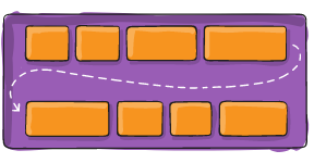
spacing
Value type: number
Supports data binding
Description
The spacing of the UI frame's child elements. This function affects frames that automatically position their children, such as stacks or scrolls. For scrolls, this function should be called on the content frame returned by GetScrollFrameContent().
Only works in legacy layouts. If you wanted to achieve a similar effect in a flex layout, you would have to adjust the children. See FlexLayouts/Margins.
Example Usage
<VStack layout="legacy" padding="20" spacing="20" frameImage="frame01" >
    <Frame height="100" width="100" frameImageColor="r: 0.5, g: 1, b: 0.5, a: 1" />
    <Frame height="100" width="100" frameImageColor="r: 0.5, g: 0.5, b: 1, a: 1" />
</VStack>
Related Trigger Function(s):
leftAlignment
Value type: boolean
Supports data binding
Description
The left alignment status for the UI frame's contents, where true is left-aligned and false is not. This only works in legacy layouts. To achieve a similar effect in a flex layout, use justifyContent.
Example Usage
<Frame layout="legacy" height="200" width="200" leftAlignment="true" frameImageColor="r: 1, g: 0, b: 1, a: 0.4">
    <Frame frameImage="cart" height="100" width="100" />
</Frame>
Related Trigger Function(s):
rightAlignment
Value type: boolean
Supports data binding
Description
The right alignment status for the UI frame's contents, where true is right-aligned and false is not. This only works in legacy layouts. To achieve a similar effect in a flex layout, use justifyContent.
Example Usage
<Frame layout="legacy" height="200" width="200" rightAlignment="true" frameImageColor="r: 1, g: 0, b: 1, a: 0.4">
    <Frame frameImage="cart" height="100" width="100" />
</Frame>
Related Trigger Function(s):
topAlignment
Value type: boolean
Supports data binding
Description
The top alignment status for the UI frame's contents, where true is top-aligned and false is not. This only works in legacy layouts. To achieve a similar effect in a flex layout, use alignItems.
Example Usage
<Frame layout="legacy" height="200" width="200" topAlignment="true" frameImageColor="r: 1, g: 0, b: 1, a: 0.4">
    <Frame frameImage="cart" height="100" width="100" />
</Frame>
Related Trigger Function(s):
bottomAlignment
Value type: boolean
Supports data binding
Description
The bottom alignment status for the UI frame's contents, where true is bottom-aligned and false is not. This only works in legacy layouts. To achieve a similar effect in a flex layout, use alignItems.
Example Usage
<Frame layout="legacy" height="200" width="200" bottomAlignment="true" frameImageColor="r: 1, g: 0, b: 1, a: 0.4">
    <Frame frameImage="cart" height="100" width="100" />
</Frame>
Related Trigger Function(s):
centerAlignment
Value type: boolean
Supports data binding
Description
The center alignment status for the UI frame's contents, where true is center-aligned and false is not. This is the default alignment.
This only works in legacy layouts. To achieve a similar effect in a flex layout, try adding justifyContent or alignItems to the parent.
Example Usage
<Frame layout="legacy" height="200" width="200" centerAlignment="true" frameImageColor="r: 1, g: 0, b: 1, a: 0.4">
    <Frame frameImage="cart" height="100" width="100" />
</Frame>
Related Trigger Function(s):
alpha
Value type: number
Supports data binding
Description
The alpha value for the UI frame. This controls the transparency of the frame, and has a compounding effect with the alpha value of the background image color. This alpha value will also be applied to any children frames, making them transparent or opaque in turn - this cannot be overwritten by calling this function on children frames.
Example Usage
<Frame layout="flex" frameImage="cart" useImageSizeRatio="1" alpha="0.5" />Related Trigger Function(s):
useImageSizeRatio
Value type: number
Supports data binding
Description
This ratio determines the size of the frame based on the size of its background image, where 1 is the original size of the image. This size ratio will not overwrite a set size for the frame. Larger values will display a larger image.
Example Usage
<Frame layout="flex" frameImage="cart" useImageSizeRatio="1" />Related Trigger Function(s):
frameSizeByBackgroundImageSizeAndRatio
Value type: number
⚠️Warning⚠️: This attribute was deprecated at editor version: 0.25.0, and will be removed after 90 days.
Supports data binding
Description
The image size ratio for the UI frame. Functionally identical to useImageSizeRatio, may be deprecated.
Example Usage
<Frame backgroundImage="cart" frameSizeByBackgroundImageSizeAndRatio="1" />Related Trigger Function(s):
backgroundImageExpression
Value type: string
⚠️Warning⚠️: This attribute was deprecated at editor version: 0.25.0, and will be removed after 90 days.
Supports data binding
Description
The background image expression for the UI frame. Expressions use data bound by BindLuaTable().
Example Usage
<Frame backgroundImageExpression="data.image" useImageSizeRatio="1" />Where "data.image" is data bound in lua:
local data = {image = "cart"}
DCEI.BindLuaTable("data", data)
Related Trigger Function(s):
Related UI XML Properties:
backgroundImageFillAmount
Value type: number
⚠️Warning⚠️: This attribute was deprecated at editor version: 0.25.0, and will be removed after 90 days.
Supports data binding
Description
The background image fill amount for the UI frame, from 0-1.
Example Usage
<Frame backgroundImage="cart" backgroundImageFillAmount="0.5" useImageSizeRatio="1" />Related Trigger Function(s):
backgroundImageFillHorizontal
Value type: boolean
⚠️Warning⚠️: This attribute was deprecated at editor version: 0.25.0, and will be removed after 90 days.
Supports data binding
Description
The background image horizontal fill status of the UI frame in its parent, where true means the background image fill is horizontal and false means it is not. This is the default fill direction.
Example Usage
<Frame backgroundImage="cart" backgroundImageFillAmount="0.5" backgroundImageFillHorizontal="true" useImageSizeRatio="1" />Horizontal fill origin left:

Horizontal fill origin right:

Related Trigger Function(s):
backgroundImageFillVertical
Value type: boolean
⚠️Warning⚠️: This attribute was deprecated at editor version: 0.25.0, and will be removed after 90 days.
Supports data binding
Description
The background image vertical fill status of the UI frame in its parent, where true means the background image fill is vertical and false means it is not.
Example Usage
<Frame backgroundImage="cart" backgroundImageFillAmount="0.5" backgroundImageFillVertical="true" useImageSizeRatio="1" />Vertical fill origin bottom:

Vertical fill origin top:

Related Trigger Function(s):
backgroundImageFillRadial
Value type: boolean
⚠️Warning⚠️: This attribute was deprecated at editor version: 0.25.0, and will be removed after 90 days.
Supports data binding
Description
The background image radial fill status of the UI frame in its parent, where true means the background image fill is radial and false means it is not.
Example Usage
<Frame backgroundImage="cart" backgroundImageFillAmount="0.75" backgroundImageFillRadial="true" useImageSizeRatio="1" />Radial fill origin bottom:

Radial fill origin right:

Radial fill origin top:

Radial fill origin left:

Related Trigger Function(s):
backgroundImageFillOrigin
Value type: number
⚠️Warning⚠️: This attribute was deprecated at editor version: 0.25.0, and will be removed after 90 days.
Supports data binding
Description
The background image fill origin side of the UI frame in its parent.
[0, 1] for horizontal or vertical fills ([left, right] and [bottom, top])
[0, 1, 2, 3] for radial fills ([bottom, right, top, left])
Horizontal fill origin left:
Horizontal fill origin right:
Vertical fill origin bottom:
Vertical fill origin top:
Radial fill origin bottom:
Radial fill origin right:
Radial fill origin top:
Radial fill origin left:
Example Usage
<Frame backgroundImage="cart" backgroundImageFillAmount="0.75" backgroundImageFillRadial="true" backgroundImageFillOrigin="3" useImageSizeRatio="1" />Related Trigger Function(s):
backgroundImageFillAmountExpression
Value type: string
⚠️Warning⚠️: This attribute was deprecated at editor version: 0.25.0, and will be removed after 90 days.
Supports data binding
Description
The background image fill amount expression for the UI frame. Expressions use data bound by BindLuaTable().
Example Usage
<Frame backgroundImage="cart" backgroundImageFillAmountExpression="data.fill" useImageSizeRatio="1" />Where "data.fill" is data bound in lua:
local data = {fill = 0.5}
DCEI.BindLuaTable("data", data)
Related Trigger Function(s):
backgroundImageTiled
Value type: boolean
⚠️Warning⚠️: This attribute was deprecated at editor version: 0.25.0, and will be removed after 90 days.
Supports data binding
Description
The background image tiling status for the UI frame. By default this is true for 9 sliced images.
Example Usage
<Frame backgroundImage="frame01" height="300" width="300" backgroundImageTiled="false" />Related Trigger Function(s):
backgroundImagePixelsPerUnitMultiplier
Value type: number
⚠️Warning⚠️: This attribute was deprecated at editor version: 0.25.0, and will be removed after 90 days.
Supports data binding
Description
The background image pixels per unit multiplier for the UI frame. For 9 sliced images, this will increase or decrease the amount of tile slices used in the background image.
Example Usage
<!-- standard cart background image -->
<Frame backgroundImage="cart" useImageSizeRatio="1" horizontalOffsetInParent="-300" backgroundImagePixelsPerUnitMultiplier="1" backgroundImageTiled="true" />

<!-- 9-sliced frame background image -->
<Frame backgroundImage="frame01_blue" height="250" width="250" horizontalOffsetInParent="300" backgroundImagePixelsPerUnitMultiplier="1" />
Lua code to render the frames:
    local xml = DCEI.CreateFrameFromXml(DCEI.GetUiRootFrame(), "frame")
    local cart = DCEI.CreateFrameFromXml(DCEI.GetUiRootFrame(), "cart")
The example usage above produces this output:

Both frames look normal.
When backgroundImagePixelsPerUnitMultiplier is given a value of 2:

On the left, there is now a grid of cart images, and on the right the 9-sliced image has sharper corners.
When backgroundImagePixelsPerUnitMultiplier is given a value of 0.5:

On the left, the cart image only displays the bottom right corner as that is all it has space for, and on the right the 9-sliced image is much more rounded. Both images are also noticeably more pixilated.
Related Trigger Function(s):
frameImageExpression
Value type: string
Supports data binding
Description
The frame image expression for the UI frame. Expressions use data bound by BindLuaTable().
Example Usage
<Frame layout="flex" frameImageExpression="data.image" useImageSizeRatio="1" />Where "data.image" is data bound in lua:
local data = {image = "cart"}
DCEI.BindLuaTable("data", data)
Related Trigger Function(s):
Related UI XML Properties:
frameImageFillAmount
Value type: number
Supports data binding
Description
The frame image fill amount for the UI frame, from 0-1.
Example Usage
<Frame layout="flex" frameImage="cart" frameImageFillAmount="0.5" useImageSizeRatio="1" />Related Trigger Function(s):
frameImageFillHorizontal
Value type: boolean
Supports data binding
Description
The frame image horizontal fill status of the UI frame in its parent, where true means the frame image fill is horizontal and false means it is not. This is the default fill direction.
Example Usage
<Frame layout="flex" frameImage="cart" frameImageFillAmount="0.5" frameImageFillHorizontal="true" useImageSizeRatio="1" />Horizontal fill origin left:
Horizontal fill origin right:
Related Trigger Function(s):
frameImageFillVertical
Value type: boolean
Supports data binding
Description
The frame image vertical fill status of the UI frame in its parent, where true means the frame image fill is vertical and false means it is not.
Example Usage
<Frame layout="flex" frameImage="cart" frameImageFillAmount="0.5" frameImageFillVertical="true" useImageSizeRatio="1" />Vertical fill origin bottom:
Vertical fill origin top:
Related Trigger Function(s):
frameImageFillRadial
Value type: boolean
Supports data binding
Description
The frame image radial fill status of the UI frame in its parent, where true means the frame image fill is radial and false means it is not.
Example Usage
<Frame layout="flex" frameImage="cart" frameImageFillAmount="0.5" frameImageFillRadial="true" useImageSizeRatio="1" />Radial fill origin bottom:
Radial fill origin right:
Radial fill origin top:
Radial fill origin left:
Related Trigger Function(s):
frameImageFillOrigin
Value type: number
Supports data binding
Description
The frame image fill origin side of the UI frame in its parent.
[0, 1] for horizontal or vertical fills ([left, right] and [bottom, top])
[0, 1, 2, 3] for radial fills ([bottom, right, top, left])
Horizontal fill origin left:
Horizontal fill origin right:
Vertical fill origin bottom:
Vertical fill origin top:
Radial fill origin bottom:
Radial fill origin right:
Radial fill origin top:
Radial fill origin left:
Example Usage
<Frame layout="flex" frameImage="cart" frameImageFillAmount="0.75" frameImageFillRadial="true" frameImageFillOrigin="3" useImageSizeRatio="1" />Related Trigger Function(s):
frameImageFillAmountExpression
Value type: string
Supports data binding
Description
The frame image fill amount expression for the UI frame. Expressions use data bound by BindLuaTable().
Example Usage
<Frame layout="flex" frameImage="cart" frameImageFillAmountExpression="data.fill" useImageSizeRatio="1" />Where "data.fill" is data bound in lua:
local data = { fill = 0.5 }
DCEI.BindLuaTable("data", data)
Related Trigger Function(s):
frameImageTiled
Value type: boolean
Supports data binding
Description
The frame image tiling status for the UI frame. By default this is true for 9 sliced images.
Example Usage
<Frame layout="flex" frameImage="frame01" height="300" width="300" frameImageTiled="false" />Related Trigger Function(s):
frameImagePixelsPerUnitMultiplier
Value type: number
Supports data binding
Description
The frame image pixels per unit multiplier for the UI frame. For 9 sliced images, this will increase or decrease the amount of tile slices used in the frame image.
Example Usage
<!-- standard cart background image -->
<Frame layout="flex" frameImage="cart" useImageSizeRatio="1" horizontalOffsetInParent="-300" frameImagePixelsPerUnitMultiplier="1" frameImageTiled="true" />

<!-- 9-sliced frame background image -->
<Frame layout="flex" frameImage="frame01_blue" height="250" width="250" horizontalOffsetInParent="300" frameImagePixelsPerUnitMultiplier="1" />
The example usage above produces this output:
Both frames look normal.
When backgroundImagePixelsPerUnitMultiplier is given a value of 2:
On the left, there is now a grid of cart images, and on the right the 9-sliced image has sharper corners.
When backgroundImagePixelsPerUnitMultiplier is given a value of 0.5:
On the left, the cart image only displays the bottom right corner as that is all it has space for, and on the right the 9-sliced image is much more rounded. Both images are also noticeably more pixilated.
Related Trigger Function(s):
widthExpression
Value type: string
Supports data binding
Description
The width expression for the UI frame. Expressions use data bound by BindLuaTable().
Example Usage
<Frame layout="flex" frameImage="cart" width="data.width" height="data.height" />Where "data.width" is data bound in lua:
local data = { width = 100, height = 100 }
DCEI.BindLuaTable("data", data)
Related Trigger Function(s):
heightExpression
Value type: string
Supports data binding
Description
The height expression for the UI frame. Expressions use data bound by BindLuaTable().
Example Usage
<Frame layout="flex" frameImage="cart" width="data.width" height="data.height" />Where "data.height" is data bound in lua:
local data = {width = 100, height = 100}
DCEI.BindLuaTable("data", data)
Related Trigger Function(s):
backgroundImageColor
Value type: color
⚠️Warning⚠️: This attribute was deprecated at editor version: 0.25.0, and will be removed after 90 days.
Supports data binding
Description
The background image color or tint for the UI frame, using RGBA values (valid values are between 0 and 1). Note that frames without background images can be tinted a solid color. Alpha 1 is completely opaque, alpha 0 is completely transparent.
Example Usage
<Frame height="100" width="100" backgroundImageColor="r: 0.5, g: 1, b: 0.5, a: 1" />Related Trigger Function(s):
Related UI XML Properties:
backgroundImageColorExpressionR
Value type: string
⚠️Warning⚠️: This attribute was deprecated at editor version: 0.25.0, and will be removed after 90 days.
Description
The background image color's R value expression for the UI frame. Expressions use data bound by BindLuaTable().
Example Usage
<Frame backgroundImage="cart" backgroundImageColorExpressionR="data.R" backgroundImageColorExpressionG="data.G" backgroundImageColorExpressionB="data.B" backgroundImageColorExpressionA="data.A" useImageSizeRatio="1" />Where "data.R", "data.G", "data.B", and "data.A" are data bound in lua:
local data = {R = 1, G = 1, B = 1, A = 1}
DCEI.BindLuaTable("data", data)
Related Trigger Function(s):
- SetFrameImageColorExpression()
- [BindLuaTable()](Trigger-API-Reference-DCEI-Functions-Custom-UI#bindluatable-2
backgroundImageColorExpressionG
Value type: string
⚠️Warning⚠️: This attribute was deprecated at editor version: 0.25.0, and will be removed after 90 days.
Description
The background image color's G value expression for the UI frame. Expressions use data bound by BindLuaTable().
Example Usage
<Frame backgroundImage="cart" backgroundImageColorExpressionR="data.R" backgroundImageColorExpressionG="data.G" backgroundImageColorExpressionB="data.B" backgroundImageColorExpressionA="data.A" useImageSizeRatio="1" />Where "data.R", "data.G", "data.B", and "data.A" are data bound in lua:
local data = {R = 1, G = 1, B = 1, A = 1}
DCEI.BindLuaTable("data", data)
Related Trigger Function(s):
backgroundImageColorExpressionB
Value type: string
⚠️Warning⚠️: This attribute was deprecated at editor version: 0.25.0, and will be removed after 90 days.
Description
The background image color's B value expression for the UI frame. Expressions use data bound by BindLuaTable().
Example Usage
<Frame backgroundImage="cart" backgroundImageColorExpressionR="data.R" backgroundImageColorExpressionG="data.G" backgroundImageColorExpressionB="data.B" backgroundImageColorExpressionA="data.A" useImageSizeRatio="1" />Where "data.R", "data.G", "data.B", and "data.A" are data bound in lua:
local data = {R = 1, G = 1, B = 1, A = 1}
DCEI.BindLuaTable("data", data)
Related Trigger Function(s):
backgroundImageColorExpressionA
Value type: string
⚠️Warning⚠️: This attribute was deprecated at editor version: 0.25.0, and will be removed after 90 days.
Description
The background image color's A value expression for the UI frame. Expressions use data bound by BindLuaTable().
Example Usage
<Frame backgroundImage="cart" backgroundImageColorExpressionR="data.R" backgroundImageColorExpressionG="data.G" backgroundImageColorExpressionB="data.B" backgroundImageColorExpressionA="data.A" useImageSizeRatio="1" />Where "data.R", "data.G", "data.B", and "data.A" are data bound in lua:
local data = {R = 1, G = 1, B = 1, A = 1}
DCEI.BindLuaTable("data", data)
Related Trigger Function(s):
backgroundImageGrayScale
Value type: boolean
⚠️Warning⚠️: This attribute was deprecated at editor version: 0.25.0, and will be removed after 90 days.
Supports data binding
Description
The background image gray scale status for the UI frame, where true means the background image is in gray scale and false means it is not.
Example Usage
<Frame backgroundImage="cart" useImageSizeRatio="1" backgroundImageGrayScale="true" />Related Trigger Function(s):
frameImageColor
Value type: color
Supports data binding
Description
The frame image color or tint for the UI frame, using RGBA values (valid values are between 0 and 1). Note that frames without images can be tinted a solid color. Alpha 1 is completely opaque, alpha 0 is completely transparent.
Example Usage
<Frame layout="flex" height="100" width="100" frameImageColor="r: 0.5, g: 1, b: 0.5, a: 1" />Related Trigger Function(s):
Related UI XML Properties:
frameImageColorExpressionR
Value type: string
Description
The frame image color's R value expression for the UI frame. Expressions use data bound by BindLuaTable().
Example Usage
<Frame layout="flex" frameImage="cart" frameImageColorExpressionR="data.R" frameImageColorExpressionG="data.G" frameImageColorExpressionB="data.B" frameImageColorExpressionA="data.A" useImageSizeRatio="1" />Where "data.R", "data.G", "data.B", and "data.A" are data bound in lua:
local data = {R = 1, G = 1, B = 1, A = 1}
DCEI.BindLuaTable("data", data)
Related Trigger Function(s):
frameImageColorExpressionG
Value type: string
Description
The frame image color's G value expression for the UI frame. Expressions use data bound by BindLuaTable().
Example Usage
<Frame layout="flex" frameImage="cart" frameImageColorExpressionR="data.R" frameImageColorExpressionG="data.G" frameImageColorExpressionB="data.B" frameImageColorExpressionA="data.A" useImageSizeRatio="1" />Where "data.R", "data.G", "data.B", and "data.A" are data bound in lua:
local data = {R = 1, G = 1, B = 1, A = 1}
DCEI.BindLuaTable("data", data)
Related Trigger Function(s):
frameImageColorExpressionB
Value type: string
Description
The frame image color's B value expression for the UI frame. Expressions use data bound by BindLuaTable().
Example Usage
<Frame layout="flex" frameImage="cart" frameImageColorExpressionR="data.R" frameImageColorExpressionG="data.G" frameImageColorExpressionB="data.B" frameImageColorExpressionA="data.A" useImageSizeRatio="1" />Where "data.R", "data.G", "data.B", and "data.A" are data bound in lua:
local data = {R = 1, G = 1, B = 1, A = 1}
DCEI.BindLuaTable("data", data)
Related Trigger Function(s):
frameImageColorExpressionA
Value type: string
Description
The frame image color's A value expression for the UI frame. Expressions use data bound by BindLuaTable().
Example Usage
<Frame layout="flex" frameImage="cart" frameImageColorExpressionR="data.R" frameImageColorExpressionG="data.G" frameImageColorExpressionB="data.B" frameImageColorExpressionA="data.A" useImageSizeRatio="1" />Where "data.R", "data.G", "data.B", and "data.A" are data bound in lua:
local data = {R = 1, G = 1, B = 1, A = 1}
DCEI.BindLuaTable("data", data)
Related Trigger Function(s):
frameImageGrayScale
Value type: boolean
Supports data binding
Description
The frame image gray scale status for the UI frame, where true means the frame image is in gray scale and false means it is not.
Example Usage
<Frame layout="flex" frameImage="cart" useImageSizeRatio="1" frameImageGrayScale="true" />Related Trigger Function(s):
tooltipText
Value type: string
Supports data binding
Description
The tooltip text for the UI frame. Child frame tooltips will show over parent frame tooltips.
Example Usage
<Frame layout="flex" frameImage="cart" useImageSizeRatio="1" tooltipText="Frame" />Related Trigger Function(s):
blockInput
Value type: boolean
Supports data binding
Description
The input blocking status for the UI frame, where true means input is being blocked and false means it is not. Requires a frame image (or color) to be set (but it can be made invisible).
Example Usage
<!-- Image blocking input -->
<Frame layout="flex" frameImage="cart" useImageSizeRatio="1" blockInput="true" />

<!-- Solid background color blocking input -->
<Frame layout="flex" frameImageColor="r: 0, g: 1, b: 1, a: 0.25" heightPercent="50" widthPercent="50" blockInput="true" />
Related Trigger Function(s):
rotation3d
Value type: vector3
Description
The 3D rotation for the UI frame.
Example Usage
<HStack layout="flex" padding="20" frameImage="frame01_purple">
    <Frame frameImage="cart" useImageSizeRatio="1" rotation3d="x: 45, y: 0, z: 0" />
    <Frame frameImage="cart" useImageSizeRatio="1" rotation3d="x: 0, y: 45, z: 0" />
    <Frame frameImage="cart" useImageSizeRatio="1" rotation3d="x: 0, y: 0, z: 45" />
</HStack>
To help visualize the rotation axis, the above example usage creates the following UI:

Related Trigger Function(s):
preview
Value type: boolean
Description
If set to true the frame will only be created in the UI Preview Window, not in-game. Useful for frames that will be created during runtime using Lua, but you still want to preview how the frame would look while designing the XML.
Example Usage
<Frame layout="flex" height="100" width="100" frameImage="cart" preview="true" />layout
Value type: layout
Values: flex, legacy (default)
Description
Setting a layout to flex enables Flex Layouts; an entirely different layout engine which has limited compatibility with legacy layout. It's more powerful and responsive, allowing for less static UI that can adjust based on screen sizes and aspect ratios.
For more info, see:
- Flex Layouts main wiki documentation page
- yogalayout documentation and playground
- Flexbox complete guide
Example Usage
<Frame layout="flex" flexDirection="column-reverse">
    <include name="DemoAttributes/BasicBlockA" />
    <include name="DemoAttributes/BasicBlockB" />
    <include name="DemoAttributes/BasicBlockC" />
</Frame>
flexDirection
Value type: flexDirection
Values: column, column-reverse, row, row-reverse
See FlexLayouts/flexDirection
Flex direction controls the direction in which children of a node are laid out.
Example Usage
<Frame layout="flex" flexDirection="column-reverse">
    <include name="DemoAttributes/BasicBlockA" />
    <include name="DemoAttributes/BasicBlockB" />
    <include name="DemoAttributes/BasicBlockC" />
</Frame>
flexGrow
Value type: number
Values: Real numbers >= 0
See FlexLayouts/flexGrow
A attribute only used by Flex Layouts. flexGrow describes how space within a container should be distributed among its children. If all items have flexGrow set to 1, the remaining space in the container will be distributed equally to all children. If one of the children has a value of 2, that child would take up twice as much of the space either one of the others.
Example Usage
<Frame layout="flex" justifyContent="space-around" alignItems="stretch" alignContent="stretch">
    <Frame layout="flex" flexDirection="row" marginBottom="25" heightPercent="50">
        <include name="DemoAttributes/BasicBlockA" widthPercent="25" flexGrow="0"/>
        <include name="DemoAttributes/BasicBlockB" widthPercent="25" flexGrow="0"/>
        <include name="DemoAttributes/BasicBlockC" widthPercent="25" flexGrow="0"/>
    </Frame>
    <Frame layout="flex" flexDirection="row" heightPercent="50">
        <include name="DemoAttributes/BasicBlockA" widthPercent="25" flexGrow="0.5" />
        <include name="DemoAttributes/BasicBlockB" widthPercent="25" flexGrow="2" />
        <include name="DemoAttributes/BasicBlockC" widthPercent="25" flexGrow="0.5" />
    </Frame>
</Frame>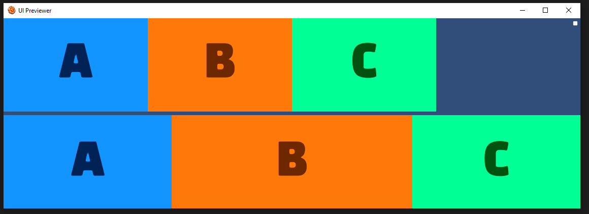
flexShrink
Value type: number
Values: Real numbers >= 0
See FlexLayouts/flexShrink
A attribute only used by Flex Layouts. flexShrink is very similar to flexGrow and can be thought of in the same way if any overflowing size is considered to be negative remaining space. These two properties also work well together by allowing children to grow and shrink as needed.
Example Usage
<Frame layout="flex" justifyContent="space-around" alignItems="stretch" alignContent="stretch">
    <Frame layout="flex" flexDirection="row" marginBottom="25" heightPercent="50">
        <include name="DemoAttributes/BasicBlockA" widthPercent="40" flexShrink="0" />
        <include name="DemoAttributes/BasicBlockB" widthPercent="40" flexShrink="0" />
        <include name="DemoAttributes/BasicBlockC" widthPercent="40" flexShrink="0" />
    </Frame>
    <Frame layout="flex" flexDirection="row" heightPercent="50">
        <include name="DemoAttributes/BasicBlockA" widthPercent="100" flexShrink="1" />
        <include name="DemoAttributes/BasicBlockB" widthPercent="100" flexShrink="1" />
        <include name="DemoAttributes/BasicBlockC" widthPercent="100" flexShrink="1" />
    </Frame>
</Frame>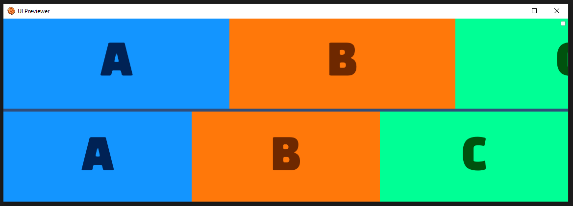
flexWrap
Value type: flexWrap
Values: wrap, wrap-reverse, no-wrap
See FlexLayouts/flexWrap
A attribute only used by Flex Layouts. By default, flex items will all try to fit onto one line. You can change that and allow the items to wrap as needed with this property.
Example Usage
<Frame layout="flex" flexDirection="row" flexWrap="wrap"  heightPercent="100" widthPercent="100" alignContent="stretch">
    <include name="DemoAttributes/BasicBlockA" widthPercent="30" maxWidth="1100" flexShrink="1" />
    <include name="DemoAttributes/BasicBlockB" widthPercent="30" maxWidth="1100" flexShrink="1" />
    <include name="DemoAttributes/BasicBlockC" widthPercent="30" maxWidth="1100" flexShrink="1" />
    <include name="DemoAttributes/BasicBlockD" widthPercent="30" maxWidth="1100" flexShrink="1" />
</Frame>
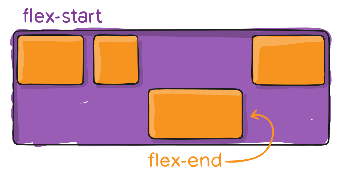
justifyContent
Value type: flexJustify
Values: center, flex-start, flex-end, space-around, space-between
See FlexLayouts/justifyContent
A attribute only used by Flex Layouts. This defines the alignment along the main axis. It helps distribute extra free space leftover when either all the flex items on a line are inflexible, or are flexible but have reached their maximum size. It also exerts some control over the alignment of items when they overflow the line. For multi-line containers, see alignContent.
Example Usage
<Frame layout="flex" justifyContent="flex-end" frameImageColor="r: 0.3, g: 0.3, b: 0.3, a: 1" widthPercent="100">
<include name="DemoAttributes/BasicBlockA" widthPercent="10" flexGrow="0" />
<include name="DemoAttributes/BasicBlockB" widthPercent="30" flexGrow="0" />
<include name="DemoAttributes/BasicBlockC" widthPercent="20" flexGrow="0" />
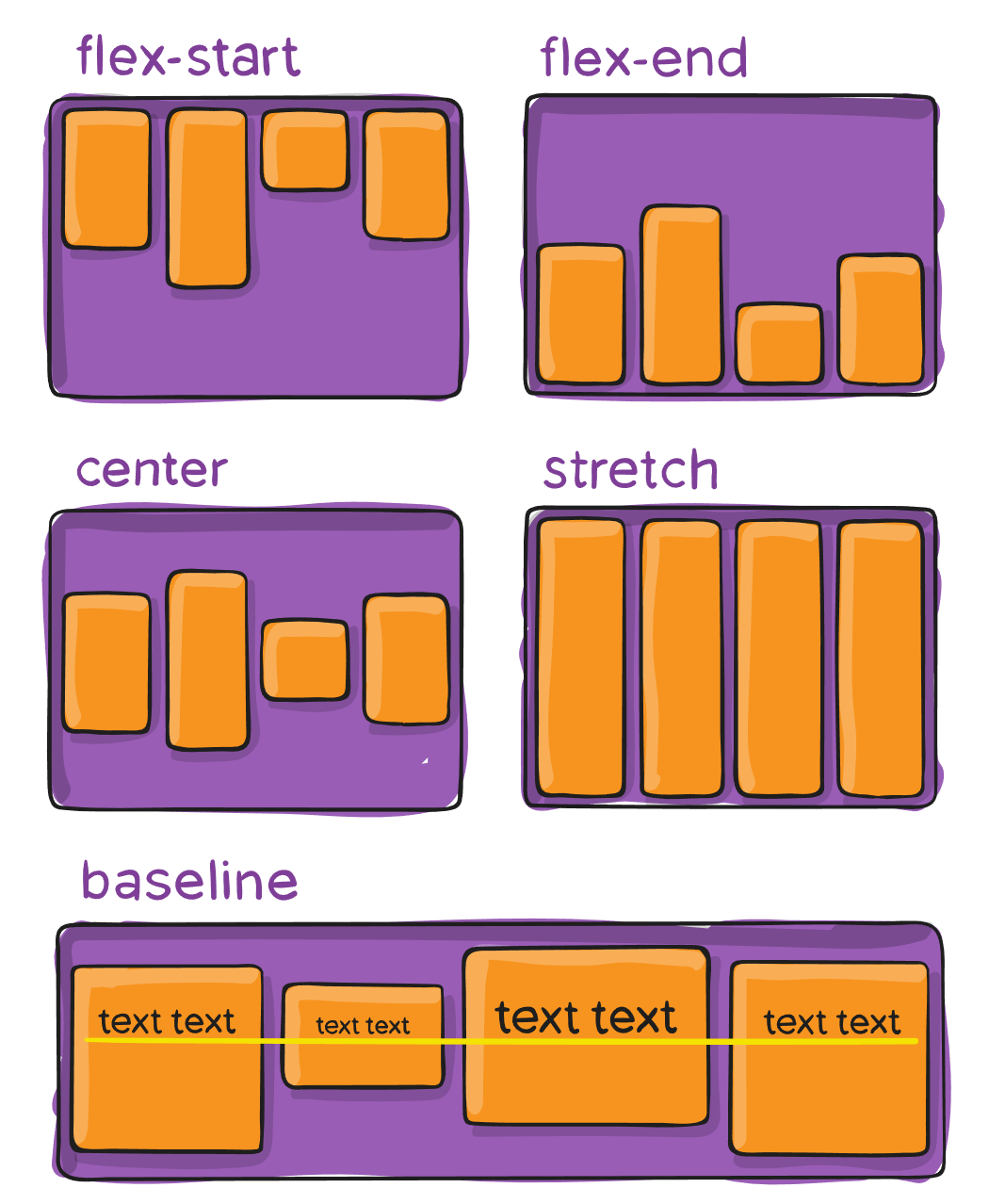
</Frame>alignItems
Value type: flexAlign
Values: center, flex-start, flex-end, baseline, stretch
See FlexLayouts/alignItems
A attribute only used by Flex Layouts. This defines the default behavior for how flex items are laid out along the cross axis on the current line. Think of it as the justify-content version for the cross-axis (perpendicular to the main-axis).
Example Usage
<Frame layout="flex" alignItems="flex-start" frameImageColor="r: 0.3, g: 0.3, b: 0.3, a: 1" widthPercent="100" heightPercent="50">
<include name="DemoAttributes/BasicBlockA" />
<include name="DemoAttributes/BasicBlockB" />
<include name="DemoAttributes/BasicBlockC" />
<include name="DemoAttributes/BasicBlockD" />
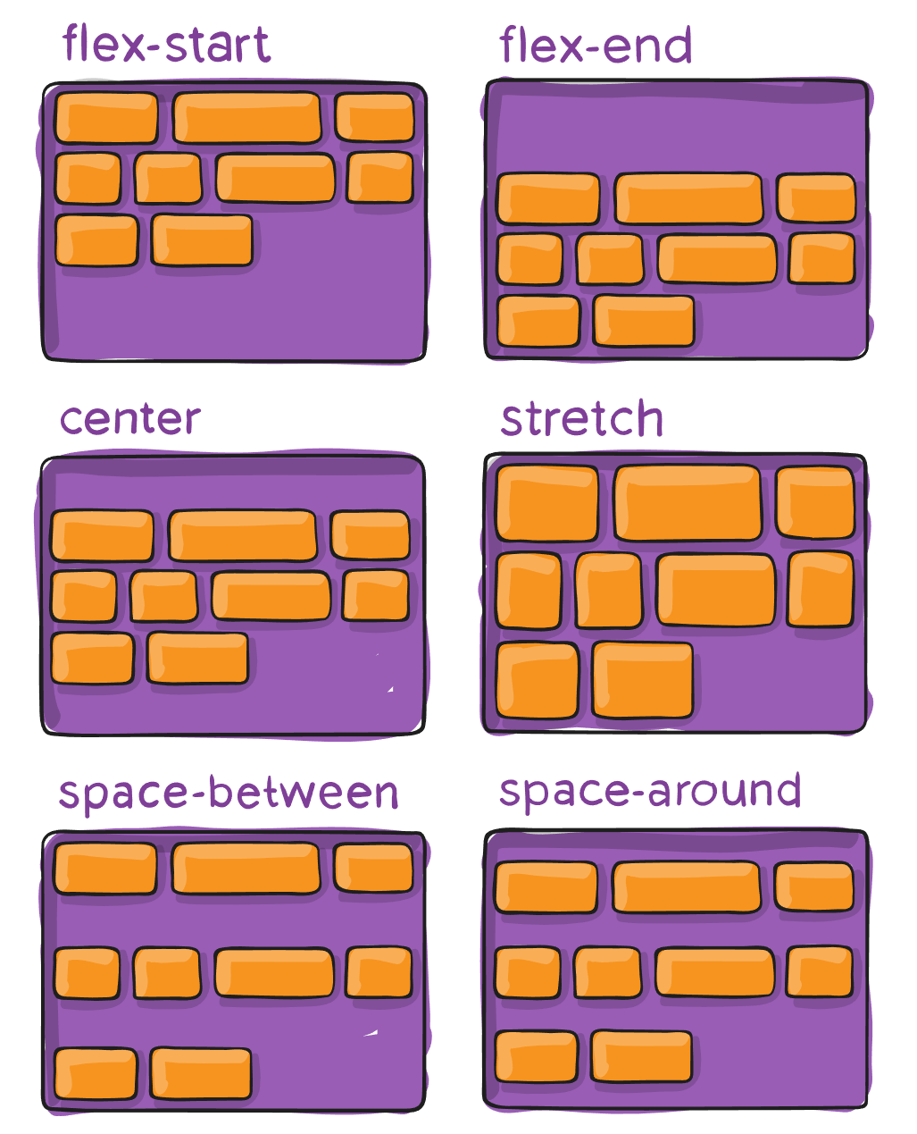
</Frame>alignContent
Value type: flexAlign
Values: baseline, center, flex-end, flex-start, stretch
See FlexLayouts/alignContent
A attribute only used by Flex Layouts. This aligns a flex container’s lines within when there is extra space in the cross-axis, similar to how justify-content aligns individual items within the main-axis.
Note: This property only takes effect on multi-line flexible containers, where flex-wrap is set to either wrap or wrap-reverse). A single-line flexible container (i.e. where flex-wrap is set to its default value, no-wrap) will not reflect align-content.
Example Usage
<Frame layout="flex" flexWrap="wrap" heightPercent="50" alignContent="flex-end" frameImageColor="r: 0.3, g: 0.3, b: 0.3, a: 1">
    <include name="DemoAttributes/BasicBlockA" width="400" />
    <include name="DemoAttributes/BasicBlockB" width="400" />
    <include name="DemoAttributes/BasicBlockC" width="400" />
    <include name="DemoAttributes/BasicBlockD" width="400" />
</Frame>
alignSelf
Value type: flexAlign
Values: baseline, center, flex-end, flex-start, stretch
See FlexLayouts/alignSelf
A attribute only used by Flex Layouts. This allows the default alignment (or the one specified by align-items) to be overridden for individual flex items.
Example Usage
<Frame layout="flex" alignItems="flex-start" heightPercent="60" frameImageColor="r: 0.3, g: 0.3, b: 0.3, a: 1">
    <include name="DemoAttributes/BasicBlockA" heightPercent="45" />
    <include name="DemoAttributes/BasicBlockB" heightPercent="45" />
    <include name="DemoAttributes/BasicBlockC" heightPercent="45" alignSelf="flex-end" />
    <include name="DemoAttributes/BasicBlockD" heightPercent="45" />
</Frame>
marginLeft
Value type: number
See FlexLayouts/Margins
A attribute only used by Flex Layouts. Margin effects the spacing around the outside of a node.
Example Usage
<Frame layout="flex" flexDirection="row" flexWrap="no-wrap" heightPercent="100" widthPercent="100" alignContent="stretch" backgroundImageColor="r: 0, g: 0, b: 0, a: 1">
    <include name="DemoAttributes/BasicBlockA" widthPercent="30" maxWidth="1100" flexShrink="1" />
    <include name="DemoAttributes/BasicBlockB" widthPercent="30" maxWidth="1100" flexShrink="1" marginLeft="45" marginRight="45" marginBottom="45" marginTop="45" />
    <include name="DemoAttributes/BasicBlockC" widthPercent="30" maxWidth="1100" flexShrink="1" />
    <include name="DemoAttributes/BasicBlockD" widthPercent="30" maxWidth="1100" flexShrink="1" />
</Frame>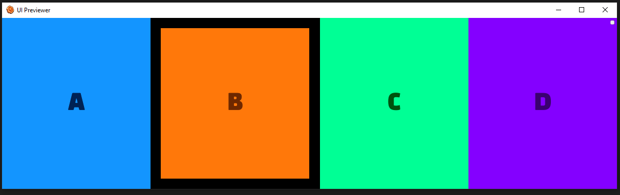
marginRight
Value type: number
See FlexLayouts/Margins
A attribute only used by Flex Layouts. Margin effects the spacing around the outside of a node.
Example Usage
<Frame layout="flex" flexDirection="row" flexWrap="no-wrap" heightPercent="100" widthPercent="100" alignContent="stretch" backgroundImageColor="r: 0, g: 0, b: 0, a: 1">
    <include name="DemoAttributes/BasicBlockA" widthPercent="30" maxWidth="1100" flexShrink="1" />
    <include name="DemoAttributes/BasicBlockB" widthPercent="30" maxWidth="1100" flexShrink="1" marginLeft="45" marginRight="45" marginBottom="45" marginTop="45" />
    <include name="DemoAttributes/BasicBlockC" widthPercent="30" maxWidth="1100" flexShrink="1" />
    <include name="DemoAttributes/BasicBlockD" widthPercent="30" maxWidth="1100" flexShrink="1" />
</Frame>
marginTop
Value type: number
See FlexLayouts/Margins
A attribute only used by Flex Layouts. Margin effects the spacing around the outside of a node.
Example Usage
<Frame layout="flex" flexDirection="row" flexWrap="no-wrap" heightPercent="100" widthPercent="100" alignContent="stretch" backgroundImageColor="r: 0, g: 0, b: 0, a: 1">
    <include name="DemoAttributes/BasicBlockA" widthPercent="30" maxWidth="1100" flexShrink="1" />
    <include name="DemoAttributes/BasicBlockB" widthPercent="30" maxWidth="1100" flexShrink="1" marginLeft="45" marginRight="45" marginBottom="45" marginTop="45" />
    <include name="DemoAttributes/BasicBlockC" widthPercent="30" maxWidth="1100" flexShrink="1" />
    <include name="DemoAttributes/BasicBlockD" widthPercent="30" maxWidth="1100" flexShrink="1" />
</Frame>
marginBottom
Value type: number
See FlexLayouts/Margins
A attribute only used by Flex Layouts. Margin effects the spacing around the outside of a node.#### Example Usage
<Frame layout="flex" flexDirection="row" flexWrap="no-wrap" heightPercent="100" widthPercent="100" alignContent="stretch" backgroundImageColor="r: 0, g: 0, b: 0, a: 1">
    <include name="DemoAttributes/BasicBlockA" widthPercent="30" maxWidth="1100" flexShrink="1" />
    <include name="DemoAttributes/BasicBlockB" widthPercent="30" maxWidth="1100" flexShrink="1" marginLeft="45" marginRight="45" marginBottom="45" marginTop="45" />
    <include name="DemoAttributes/BasicBlockC" widthPercent="30" maxWidth="1100" flexShrink="1" />
    <include name="DemoAttributes/BasicBlockD" widthPercent="30" maxWidth="1100" flexShrink="1" />
</Frame>
widthPercent
Value type: number
Values: Typically 0-100
See FlexLayouts/widthPercent
A attribute only used by Flex Layouts. This defines a frame's width as a percentage of it's parent's width.
Example Usage
<Frame layout="flex" heightPercent="75" widthPercent="75" frameImageColor="r: 1, g: 1, b: 0.5, a: 1" />heightPercent
Value type: number
Values: Typically 0-100
See FlexLayouts/heightPercent
A attribute only used by Flex Layouts. This defines a frame's height as a percentage of it's parent's height.
Example Usage
<Frame layout="flex" heightPercent="75" widthPercent="75" frameImageColor="r: 1, g: 1, b: 0.5, a: 1" />position
Value type: position
Values: relative (default), absolute
See FlexLayouts/Position
A attribute only used by Flex Layouts.
relative By default an element is positioned relatively. This means an element is positioned according to the normal flow of the layout, and then offset relative to that position based on the values of top, right, bottom, and left. The offset does not affect the position of any sibling or parent elements.
absolute When positioned absolutely an element doesn't take part in the normal layout flow. It is instead laid out independent of its siblings. The position is determined based on the top, right, bottom, and left values.
Example Usage
<Frame layout="flex" alignItems="center" flexDirection="row" backgroundImageColor="r: 0.3, g: 0.3, b: 0.3, a: 1">
    <include name="DemoAttributes/BasicBlockA" position="relative" top="15" />
    <include name="DemoAttributes/BasicBlockB" position="relative" />
    <include name="DemoAttributes/BasicBlockC" position="relative" bottom="15" />
    <include name="DemoAttributes/BasicBlockD" position="absolute" bottom="50" right="50" />
</Frame>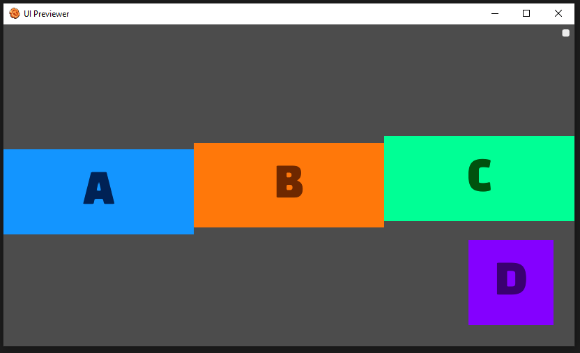
left
Value type: number
See FlexLayouts/Position
A attribute only used by Flex Layouts. This is a left-direction offset by pixels. The behavior of the offset depends if the frame position is relative or absolute.
Example Usage
<Frame layout="flex" alignItems="center" flexDirection="row" backgroundImageColor="r: 0.3, g: 0.3, b: 0.3, a: 1">
    <include name="DemoAttributes/BasicBlockA" position="relative" top="15" />
    <include name="DemoAttributes/BasicBlockB" position="relative" />
    <include name="DemoAttributes/BasicBlockC" position="relative" bottom="15" />
    <include name="DemoAttributes/BasicBlockD" position="absolute" bottom="50" left="50" />
</Frame>
right
Value type: number
See FlexLayouts/Position
A attribute only used by Flex Layouts. This is a right-direction offset by pixels. The behavior of the offset depends if the frame position is relative or absolute.
Example Usage
<Frame layout="flex" alignItems="center" flexDirection="row" backgroundImageColor="r: 0.3, g: 0.3, b: 0.3, a: 1">
    <include name="DemoAttributes/BasicBlockA" position="relative" top="15" />
    <include name="DemoAttributes/BasicBlockB" position="relative" />
    <include name="DemoAttributes/BasicBlockC" position="relative" bottom="15" />
    <include name="DemoAttributes/BasicBlockD" position="absolute" bottom="50" right="50" />
</Frame>
top
Value type: number
See FlexLayouts/Position
A attribute only used by Flex Layouts. This is a top-direction offset by pixels. The behavior of the offset depends if the frame position is relative or absolute.
Example Usage
<Frame layout="flex" alignItems="center" flexDirection="row" backgroundImageColor="r: 0.3, g: 0.3, b: 0.3, a: 1">
    <include name="DemoAttributes/BasicBlockA" position="relative" top="15" />
    <include name="DemoAttributes/BasicBlockB" position="relative" />
    <include name="DemoAttributes/BasicBlockC" position="relative" bottom="15" />
    <include name="DemoAttributes/BasicBlockD" position="absolute" bottom="50" right="50" />
</Frame>
bottom
Value type: number
See FlexLayouts/Position
A attribute only used by Flex Layouts. This is a bottom-direction offset by pixels. The behavior of the offset depends if the frame position is relative or absolute.
Example Usage
<Frame layout="flex" alignItems="center" flexDirection="row" backgroundImageColor="r: 0.3, g: 0.3, b: 0.3, a: 1">
    <include name="DemoAttributes/BasicBlockA" position="relative" top="15" />
    <include name="DemoAttributes/BasicBlockB" position="relative" />
    <include name="DemoAttributes/BasicBlockC" position="relative" bottom="15" />
    <include name="DemoAttributes/BasicBlockD" position="absolute" bottom="50" right="50" />
</Frame>
aspectRatio
Value type: number
Values: >= 0
See FlexLayouts/AspectRatio
A attribute only used by Flex Layouts.
aspectRatio describes the ratio of the width to the height. For instance, when the aspect ratio is set to 2, it means the width will be twice as large as the height.
The width or height is adjusted depending on which one is not set. If both are set, aspectRatio will adjust the height.
Example Usage
<Frame layout="flex" frameImageColor="r: 0.3, g: 0.3, b: 0.3, a: 1" widthPercent="100" heightPercent="50">
    <include name="DemoAttributes/BasicBlockA" aspectRatio="1" />
    <include name="DemoAttributes/BasicBlockB" aspectRatio="2" />
    <include name="DemoAttributes/BasicBlockC" aspectRatio="4" />
    <include name="DemoAttributes/BasicBlockD" aspectRatio="0.5" />
</Frame>
controller
Value type: string
Values: Script file associated with this frame.
Description
This attribute links an XML file to a script file, enabling the execution of code, such as animations, during preview. This allows for faster development and testing.
See the UI Controllers guide.
Example Usage
<Frame layout="flex" controller="controller" >
    <Frame width="400" height="400" backgroundImage="golden_pass_overview" />
</Frame>
Related Trigger Function(s):
class
Value type: string
Values: The name of the class defined in the style.
Description
This attribute allows you to assign specific style rules to individual frames in your UI layout.
See the Styles With Custom UI guide.
Example Usage
<!-- Style object that applies to all frames -->
<Style>
    <![CDATA[
    /* Style for all text frames */
    Text {
        color: #ff0000;
        font-size: 64px;
        -dcei-text-shadow: false;
        -dcei-text-outline: false;
    }
    .small {
        color: #00ff00;
        font-size: 32px;
    }
    .large {
        color: #0000ff20;
        font-size: 128px;
    }
    ]]>
</Style>

<!-- A different object utilizing the style -->
<Frame layout="flex" flexDirection="column">
    <Text text="test" />
    <Text class="large" text="test" />
    <Text class="small" text="test" />
</Frame>