Flex Layouts
By setting layout="flex" you can switch a UI subtree to use a different UI layout engine backed by yogalayout (which implements the CSS flexbox layout model).
The yogalayout website has playground where can freely experiment as well as visual documentation that will allow you to experiment and quickly grasp how it works. This flexbox guide us also useful to cross-reference for some more confusing fields.
The main advantage of layout="flex" over the default (layout="legacy") is the ability to make responsive UI that works for a variety of different screen sizes and aspect ratios. It also helps for making items take up a percentage of their parents size rather than using "matchParentWidth/Height" or a static size.
Finally, it can be useful any time you struggling to accomplish what you want with HStack, VStack, Scrolls, Virtual Lists, or Grids.
Some features:
- widthPercent/heightPercent to define width/height value as a percentage of the parent frame
- position=absolute and left/right/top/bottom attributes to position frames relative to the parent frame
- flexGrow/Shrink to define how a UI frame resizes according to screen resolution changes.
When using Flex layouts; it can help to realize that a frame type labeled flex will automatically arrange children similar to a Stack. You will have to change the flex-related attributes of the parent and children frames if this isn't the behavior you desire.
Example Map
This demo map demonstrates each attribute separately. Open the UI Editor (Window > UI Editor) and the UI previewer (Window > UI Previewer) and click on each frame to preview it's behavior. Resizing the UI Previewer window may make the behavior more obvious in some cases.
https://platform.wildsky.dev/arcade/game/613
(Click "Source" to download)
"Flex" <> "Legacy" Compatibility
Flex and Legacy layouts can only be combined in specific ways.
Rule 1: A legacy frame can contain either flex or legacy children
<Frame layout="legacy">
    <Frame layout="legacy" matchParentHeight="true" matchParentWidth="true" backgroundImageColor="r: 1, g: 0.400, b: 0, a: 1" />
    <Frame layout="flex" widthPercent="25" heightPercent="25" backgroundImageColor="r: 0, g: 0.400, b: 1, a: 1" />
</Frame>
Rule 2: The reverse is not true. flex frames can only contain flex children. legacy frames will be treated as flex automatically and regardless if the user attempts to specify otherwise
<Frame layout="flex">
    <Frame layout="flex" widthPercent="25" heightPercent="25" backgroundImageColor="r: 0, g: 0.400, b: 1, a: 1" />
    <-- The following `legacy` frame is actually treated as a `flex`, thus using flex properties like `widthPercent` -->
    <Frame layout="legacy" widthPercent="100" heightPercent="100" backgroundImageColor="r: 1, g: 0.400, b: 0, a: 1" />
</Frame>
Other Limitations
Currently there aren’t trigger APIs for many flex properties, including animating flex properties. This also means some GMUI helper functions for animating frames won’t work on flex layouts.
Relevant XML Attributes
layout
Set "layout="flex" to enable flex layouts on a Frame.
flexGrow
Value type: number
Values: >= 0
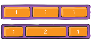
flexGrow describes how any space within a container should be distributed among its children along the main axis. After laying out its children, a container will distribute any remaining space according to the flexGrow values specified by its children.
If all items have flexGrow set to 1, the remaining space in the container will be distributed equally to all children. If one of the children has a value of 2, that child would take up twice as much of the space either one of the others (or it will try, at least).
For more info, see:
EXAMPLES (Click to expand)
<Frame layout="flex" justifyContent="space-around" alignItems="stretch" alignContent="stretch">
    <Frame layout="flex" flexDirection="row" marginBottom="25" heightPercent="50">
        <include name="DemoAttributes/BasicBlockA" widthPercent="25" flexGrow="0"/>
        <include name="DemoAttributes/BasicBlockB" widthPercent="25" flexGrow="0"/>
        <include name="DemoAttributes/BasicBlockC" widthPercent="25" flexGrow="0"/>
    </Frame>
    <Frame layout="flex" flexDirection="row" heightPercent="50">
        <include name="DemoAttributes/BasicBlockA" widthPercent="25" flexGrow="0.5" />
        <include name="DemoAttributes/BasicBlockB" widthPercent="25" flexGrow="2" />
        <include name="DemoAttributes/BasicBlockC" widthPercent="25" flexGrow="0.5" />
    </Frame>
</Frame>
flexShrink
Value type: number
Values: Real numbers >= 0
flexShrink is very similar to flexGrow and can be thought of in the same way if any overflowing size is considered to be negative remaining space. These two properties also work well together by allowing children to grow and shrink as needed.
For more info, see:
EXAMPLES (Click to expand)
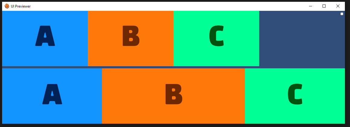
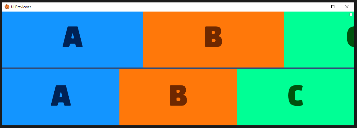
<Frame layout="flex" justifyContent="space-around" alignItems="stretch" alignContent="stretch">
    <Frame layout="flex" flexDirection="row" marginBottom="25" heightPercent="50">
        <include name="DemoAttributes/BasicBlockA" widthPercent="40" flexShrink="0" />
        <include name="DemoAttributes/BasicBlockB" widthPercent="40" flexShrink="0" />
        <include name="DemoAttributes/BasicBlockC" widthPercent="40" flexShrink="0" />
    </Frame>
    <Frame layout="flex" flexDirection="row" heightPercent="50">
        <include name="DemoAttributes/BasicBlockA" widthPercent="100" flexShrink="1" />
        <include name="DemoAttributes/BasicBlockB" widthPercent="100" flexShrink="1" />
        <include name="DemoAttributes/BasicBlockC" widthPercent="100" flexShrink="1" />
    </Frame>
</Frame>
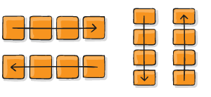
flexDirection
Value type: flexDirection
Values: row, row-reverse, column, column-reverse
Flex direction controls the direction in which children of a node are laid out. Row is the default.
For more info, see:
EXAMPLES (Click to expand)
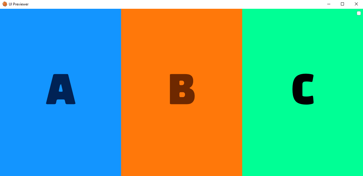
row (default)
Align children from left to right. If wrapping is enabled then the next line will start under the first item on the left of the container.
<Frame layout="flex" flexDirection="row">
    <include name="DemoAttributes/BasicBlockA" />
    <include name="DemoAttributes/BasicBlockB" />
    <include name="DemoAttributes/BasicBlockC" />
</Frame>
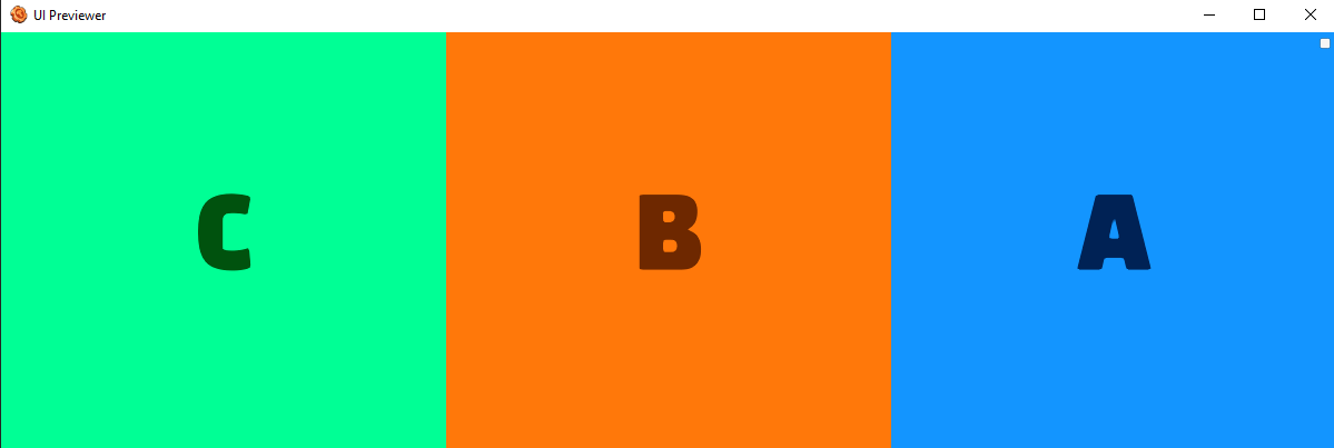
row-reverse
Align children from right to left. If wrapping is enabled then the next line will start under the first item on the right of the container.
<Frame layout="flex" flexDirection="row-reverse">
    <include name="DemoAttributes/BasicBlockA" />
    <include name="DemoAttributes/BasicBlockB" />
    <include name="DemoAttributes/BasicBlockC" />
</Frame>
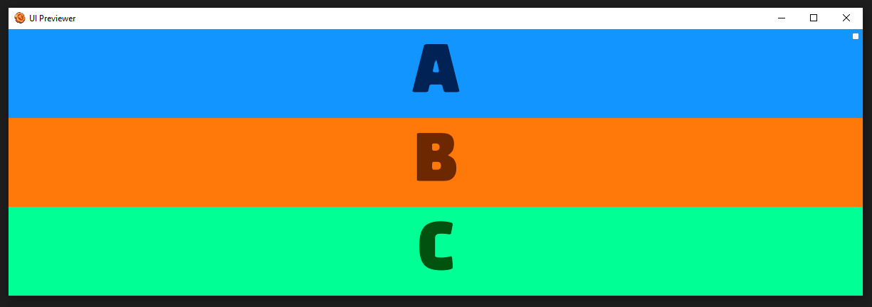
column
Align children from top to bottom. If wrapping is enabled then the next line will start to the left first item on the top of the container.
<Frame layout="flex" flexDirection="column">
    <include name="DemoAttributes/BasicBlockA" />
    <include name="DemoAttributes/BasicBlockB" />
    <include name="DemoAttributes/BasicBlockC" />
</Frame>
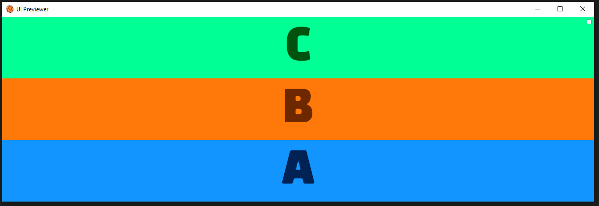
column-reverse
Align children from bottom to top. If wrapping is enabled then the next line will start to the left first item on the bottom of the container.
<Frame layout="flex" flexDirection="column-reverse">
    <include name="DemoAttributes/BasicBlockA" />
    <include name="DemoAttributes/BasicBlockB" />
    <include name="DemoAttributes/BasicBlockC" />
</Frame>
flexWrap
Value type: flexWrap
Values: no-wrap, wrap, wrap-reverse
By default, flex items will all try to fit onto one line. You can change that and allow the items to wrap as needed with this property.
For more info, see:
EXAMPLES (Click to expand)
no-wrap (default)
<Frame layout="flex" flexWrap="wrap" heightPercent="50" alignContent="no-wrap" frameImageColor="r: 0.3, g: 0.3, b: 0.3, a: 1">
    <include name="BasicBlockA" width="400" />
    <include name="BasicBlockB" width="400" />
    <include name="BasicBlockC" width="400" />
    <include name="BasicBlockD" width="400" />
</Frame>

wrap
<Frame layout="flex" flexWrap="wrap" heightPercent="50" alignContent="flex-start" frameImageColor="r: 0.3, g: 0.3, b: 0.3, a: 1">
    <include name="BasicBlockA" width="400" />
    <include name="BasicBlockB" width="400" />
    <include name="BasicBlockC" width="400" />
    <include name="BasicBlockD" width="400" />
</Frame>

wrap-reverse
<Frame layout="flex" flexWrap="wrap" heightPercent="50" alignContent="wrap-reverse" frameImageColor="r: 0.3, g: 0.3, b: 0.3, a: 1">
    <include name="BasicBlockA" width="400" />
    <include name="BasicBlockB" width="400" />
    <include name="BasicBlockC" width="400" />
    <include name="BasicBlockD" width="400" />
</Frame>

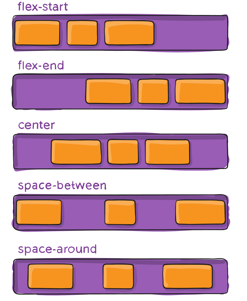
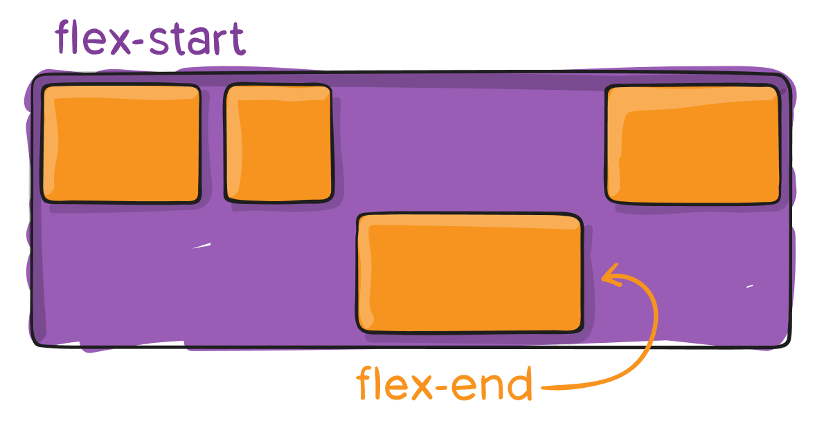
justifyContent
Value type: flexJustify
Values: center, flex-start, flex-end, space-around, space-between
This defines the alignment along the main axis. It helps distribute extra free space leftover when either all the flex items on a line are inflexible, or are flexible but have reached their maximum size. It also exerts some control over the alignment of items when they overflow the line. Center is the default.
For more info, see:
EXAMPLES (Click to expand)
center (default)
<Frame layout="flex" justifyContent="center" frameImageColor="r: 0.3, g: 0.3, b: 0.3, a: 1" widthPercent="100">
    <include name="DemoAttributes/BasicBlockA" widthPercent="10" flexGrow="0" />
    <include name="DemoAttributes/BasicBlockB" widthPercent="30" flexGrow="0" />
    <include name="DemoAttributes/BasicBlockC" widthPercent="20" flexGrow="0" />
</Frame>

flex-start
<Frame layout="flex" justifyContent="flex-start" frameImageColor="r: 0.3, g: 0.3, b: 0.3, a: 1" widthPercent="100">
    <include name="DemoAttributes/BasicBlockA" widthPercent="10" flexGrow="0" />
    <include name="DemoAttributes/BasicBlockB" widthPercent="30" flexGrow="0" />
    <include name="DemoAttributes/BasicBlockC" widthPercent="20" flexGrow="0" />
</Frame>

flex-end
<Frame layout="flex" justifyContent="flex-end" frameImageColor="r: 0.3, g: 0.3, b: 0.3, a: 1" widthPercent="100">
    <include name="DemoAttributes/BasicBlockA" widthPercent="10" flexGrow="0" />
    <include name="DemoAttributes/BasicBlockB" widthPercent="30" flexGrow="0" />
    <include name="DemoAttributes/BasicBlockC" widthPercent="20" flexGrow="0" />
</Frame>

space-around
<Frame layout="flex" justifyContent="space-around" frameImageColor="r: 0.3, g: 0.3, b: 0.3, a: 1" widthPercent="100">
    <include name="DemoAttributes/BasicBlockA" widthPercent="10" flexGrow="0" />
    <include name="DemoAttributes/BasicBlockB" widthPercent="30" flexGrow="0" />
    <include name="DemoAttributes/BasicBlockC" widthPercent="20" flexGrow="0" />
</Frame>

space-between
<Frame layout="flex" justifyContent="space-between" frameImageColor="r: 0.3, g: 0.3, b: 0.3, a: 1" widthPercent="100">
    <include name="DemoAttributes/BasicBlockA" widthPercent="10" flexGrow="0" />
    <include name="DemoAttributes/BasicBlockB" widthPercent="30" flexGrow="0" />
    <include name="DemoAttributes/BasicBlockC" widthPercent="20" flexGrow="0" />
</Frame>

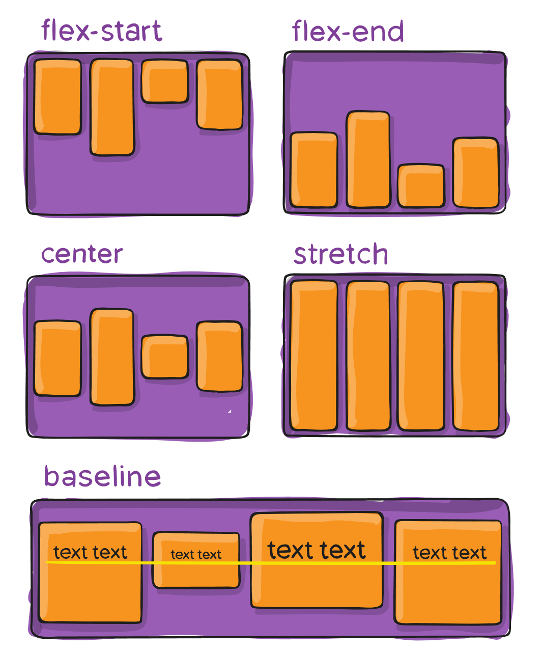
alignItems
Values: center, flex-start, flex-end, baseline, stretch
This defines the default behavior for how flex items are laid out along the cross axis on the current line. Think of it as the justify-content version for the cross-axis (perpendicular to the main-axis).
For more info, see:
EXAMPLES (Click to expand)
center (default)
<Frame layout="flex" alignItems="center" frameImageColor="r: 0.3, g: 0.3, b: 0.3, a: 1" widthPercent="100" heightPercent="50">
    <include name="DemoAttributes/BasicBlockA" />
    <include name="DemoAttributes/BasicBlockB" />
    <include name="DemoAttributes/BasicBlockC" />
    <include name="DemoAttributes/BasicBlockD" />
</Frame>

flex-start
<Frame layout="flex" alignItems="flex-start" frameImageColor="r: 0.3, g: 0.3, b: 0.3, a: 1" widthPercent="100" heightPercent="50">
    <include name="DemoAttributes/BasicBlockA" />
    <include name="DemoAttributes/BasicBlockB" />
    <include name="DemoAttributes/BasicBlockC" />
    <include name="DemoAttributes/BasicBlockD" />
</Frame>

flex-end
<Frame layout="flex" alignItems="flex-end" frameImageColor="r: 0.3, g: 0.3, b: 0.3, a: 1" widthPercent="100" heightPercent="50">
    <include name="DemoAttributes/BasicBlockA" />
    <include name="DemoAttributes/BasicBlockB" />
    <include name="DemoAttributes/BasicBlockC" />
    <include name="DemoAttributes/BasicBlockD" />
</Frame>

baseline
<Frame layout="flex" alignItems="baseline" frameImageColor="r: 0.3, g: 0.3, b: 0.3, a: 1" widthPercent="100" heightPercent="50">
    <include name="DemoAttributes/BasicBlockA" widthPercent="1" height="300" />
    <include name="DemoAttributes/BasicBlockB" widthPercent="1" height="250" />
    <include name="DemoAttributes/BasicBlockC" widthPercent="1" height="200" />
    <include name="DemoAttributes/BasicBlockD" widthPercent="1" />
</Frame>

stretch
<Frame layout="flex" alignItems="stretch" frameImageColor="r: 0.3, g: 0.3, b: 0.3, a: 1" widthPercent="100" heightPercent="50">
    <include name="DemoAttributes/BasicBlockA" />
    <include name="DemoAttributes/BasicBlockB" />
    <include name="DemoAttributes/BasicBlockC" />
    <include name="DemoAttributes/BasicBlockD" />
</Frame>

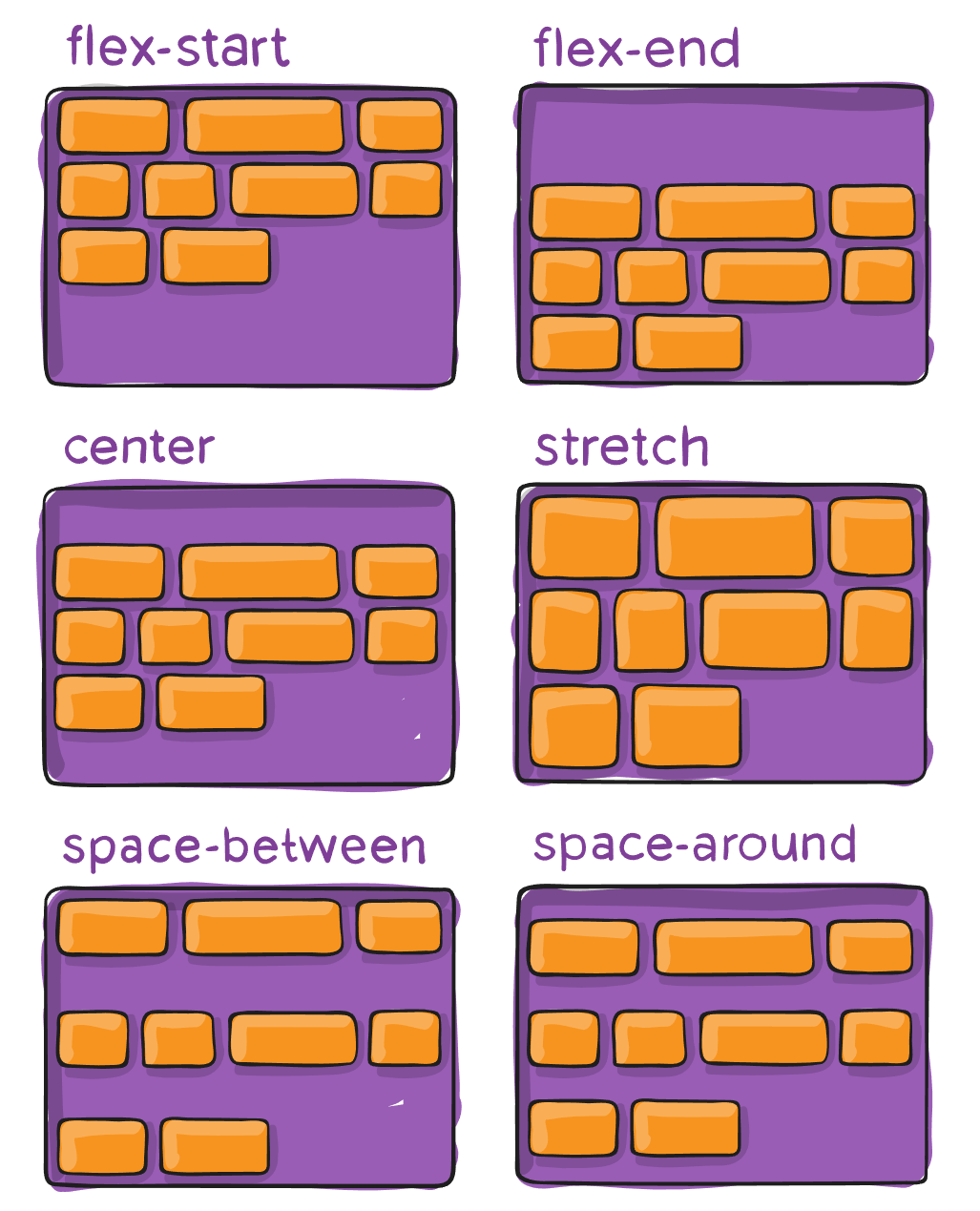
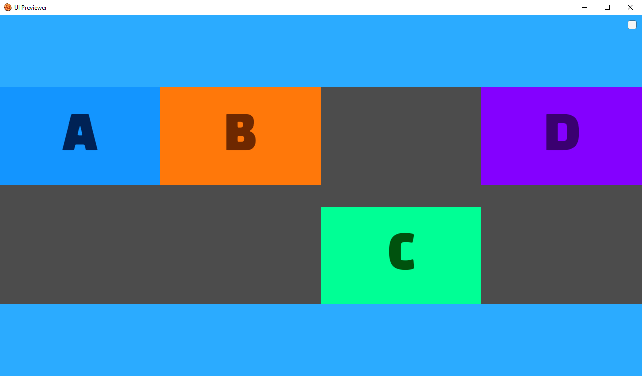
alignContent
Values: flex-start, flex-end, center, stretch, space-between, space-around
This aligns a flex container’s lines within when there is extra space in the cross-axis, similar to how justify-content aligns individual items within the main-axis.
Note: This property only takes effect on multi-line flexible containers, where flex-wrap is set to either wrap or wrap-reverse). A single-line flexible container (i.e. where flex-wrap is set to its default value, no-wrap) will not reflect align-content.
For more info, see:
EXAMPLES (Click to expand)
flex-start
<Frame layout="flex" flexWrap="wrap" heightPercent="50" alignContent="flex-start" frameImageColor="r: 0.3, g: 0.3, b: 0.3, a: 1">
    <include name="BasicBlockA" width="400" />
    <include name="BasicBlockB" width="400" />
    <include name="BasicBlockC" width="400" />
    <include name="BasicBlockD" width="400" />
</Frame>

flex-end
<Frame layout="flex" flexWrap="wrap" heightPercent="50" alignContent="flex-end" frameImageColor="r: 0.3, g: 0.3, b: 0.3, a: 1">
    <include name="BasicBlockA" width="400" />
    <include name="BasicBlockB" width="400" />
    <include name="BasicBlockC" width="400" />
    <include name="BasicBlockD" width="400" />
</Frame>

center
<Frame layout="flex" flexWrap="wrap" heightPercent="50" alignContent="center" frameImageColor="r: 0.3, g: 0.3, b: 0.3, a: 1">
    <include name="BasicBlockA" width="400" />
    <include name="BasicBlockB" width="400" />
    <include name="BasicBlockC" width="400" />
    <include name="BasicBlockD" width="400" />
</Frame>

stretch
<Frame layout="flex" flexWrap="wrap" heightPercent="50" alignContent="stretch" frameImageColor="r: 0.3, g: 0.3, b: 0.3, a: 1">
    <include name="BasicBlockA" width="400" />
    <include name="BasicBlockB" width="400" />
    <include name="BasicBlockC" width="400" />
    <include name="BasicBlockD" width="400" />
</Frame>

space-between
<Frame layout="flex" flexWrap="wrap" heightPercent="50" alignContent="space-between" frameImageColor="r: 0.3, g: 0.3, b: 0.3, a: 1">
    <include name="BasicBlockA" width="400" />
    <include name="BasicBlockB" width="400" />
    <include name="BasicBlockC" width="400" />
    <include name="BasicBlockD" width="400" />
</Frame>

space-around
<Frame layout="flex" flexWrap="wrap" heightPercent="50" alignContent="space-around" frameImageColor="r: 0.3, g: 0.3, b: 0.3, a: 1">
    <include name="BasicBlockA" width="400" />
    <include name="BasicBlockB" width="400" />
    <include name="BasicBlockC" width="400" />
    <include name="BasicBlockD" width="400" />
</Frame>

alignSelf
Values: baseline, center, flex-end, flex-start, stretch
This allows the default alignment (or the one specified by align-items) to be overridden for individual flex items.
For more info, see:
EXAMPLE (Click to expand)
<Frame layout="flex" alignItems="flex-start" heightPercent="60" frameImageColor="r: 0.3, g: 0.3, b: 0.3, a: 1">
    <include name="DemoAttributes/BasicBlockA" heightPercent="45" />
    <include name="DemoAttributes/BasicBlockB" heightPercent="45" />
    <include name="DemoAttributes/BasicBlockC" heightPercent="45" alignSelf="flex-end" />
    <include name="DemoAttributes/BasicBlockD" heightPercent="45" />
</Frame>
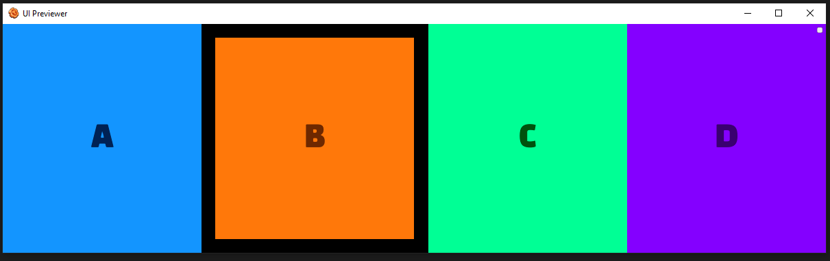
Margins
Includes:
marginLeft
marginRight
marginTop
marginBottom
Values: number
Margin effects the spacing around the outside of a node. A node with margin will offset itself from the bounds of its parent but also offset the location of any siblings. The margin of a node contributes to the total size of its parent if the parent is auto sized.
For more info, see:
EXAMPLES (Click to expand)
<Frame layout="flex" flexDirection="row" flexWrap="no-wrap" heightPercent="100" widthPercent="100" alignContent="stretch" backgroundImageColor="r: 0, g: 0, b: 0, a: 1">
    <include name="DemoAttributes/BasicBlockA" widthPercent="30" maxWidth="1100" flexShrink="1" />
    <include name="DemoAttributes/BasicBlockB" widthPercent="30" maxWidth="1100" flexShrink="1" marginLeft="45" marginRight="45" marginBottom="45" marginTop="45" />
    <include name="DemoAttributes/BasicBlockC" widthPercent="30" maxWidth="1100" flexShrink="1" />
    <include name="DemoAttributes/BasicBlockD" widthPercent="30" maxWidth="1100" flexShrink="1" />
</Frame>
widthPercent
Values: Typically 0-100
This defines a frame's width as a percentage of it's parent's width.
heightPercent
Values: Typically 0-100
This defines a frame's height as a percentage of it's parent's height.
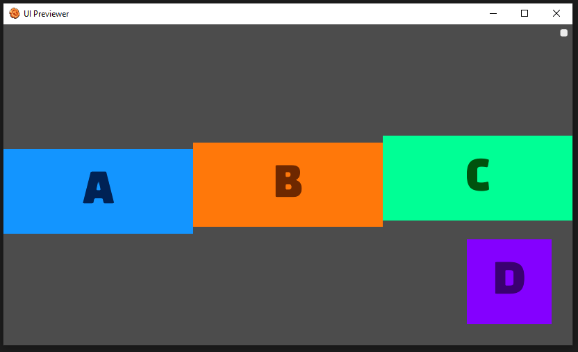
position
relative By default an element is positioned relatively. This means an element is positioned according to the normal flow of the layout, and then offset relative to that position based on the values of top, right, bottom, and left. The offset does not affect the position of any sibling or parent elements.
absolute When positioned absolutely an element doesn't take part in the normal layout flow. It is instead laid out independent of its siblings. The position is determined based on the top, right, bottom, and left values.
Offsets:
left
right
top
bottom
Offsets in each direction (different behavior depending if the position is absolute or relative)
For more info, see:
EXAMPLES (Click to expand)
<Frame layout="flex" alignItems="center" flexDirection="row" backgroundImageColor="r: 0.3, g: 0.3, b: 0.3, a: 1">
    <include name="DemoAttributes/BasicBlockA" position="relative" top="15" />
    <include name="DemoAttributes/BasicBlockB" position="relative" />
    <include name="DemoAttributes/BasicBlockC" position="relative" bottom="15" />
    <include name="DemoAttributes/BasicBlockD" position="absolute" bottom="50" right="50" />
</Frame>
aspectRatio
Value type: number
Values: >= 0
aspectRatio describes the ratio of the width to the height. For instance, when the aspect ratio is set to 2, it means the width will be twice as large as the height.
The width or height is adjusted depending on which one is not set. If both are set, aspectRatio will adjust the height.
For more info, see:
EXAMPLE (Click to expand)
<Frame layout="flex" frameImageColor="r: 0.3, g: 0.3, b: 0.3, a: 1" widthPercent="100" heightPercent="50">
    <include name="DemoAttributes/BasicBlockA" aspectRatio="1" />
    <include name="DemoAttributes/BasicBlockB" aspectRatio="2" />
    <include name="DemoAttributes/BasicBlockC" aspectRatio="4" />
    <include name="DemoAttributes/BasicBlockD" aspectRatio="0.5" />
</Frame>
